


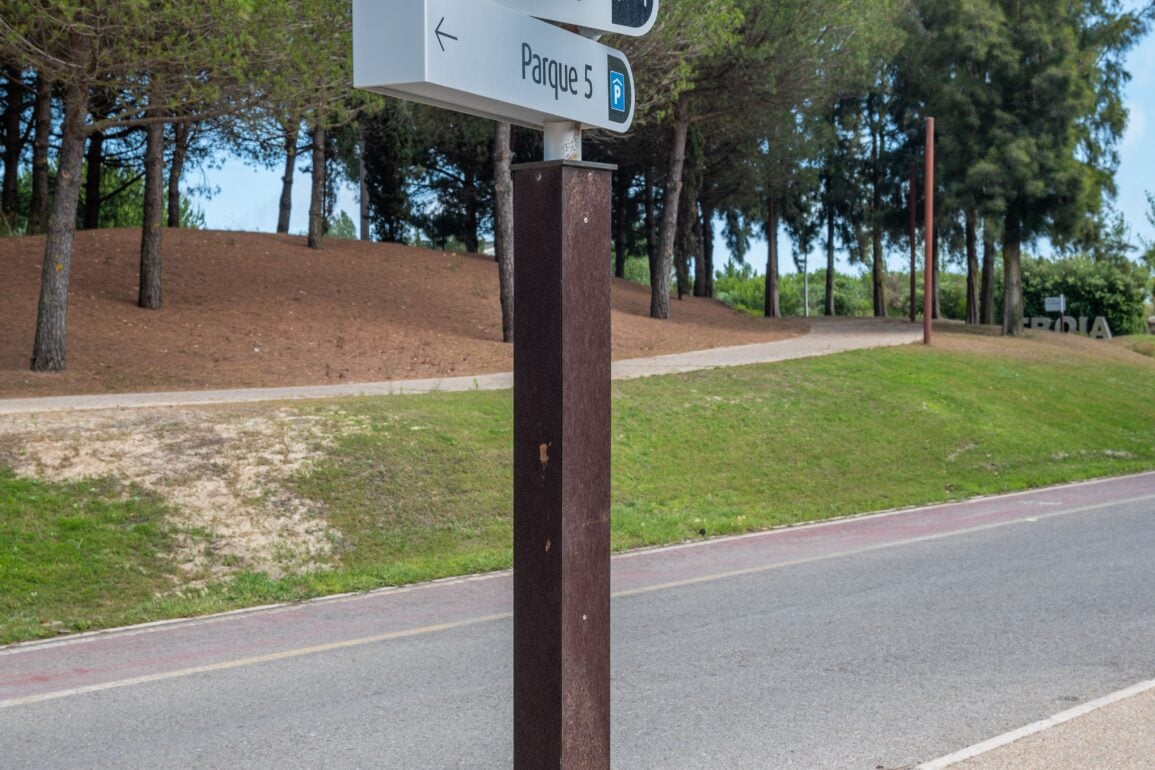
Wayfinding signage has always walked a fine line between form and function. A sign that looks stunning but fails to guide someone from point A to point B has missed its entire purpose. As we look toward 2026, two distinct aesthetic philosophies are shaping how businesses, campuses, hospitals, and public spaces approach signage design: minimalism and bold expressiveness. Both approaches can deliver on functionality, but they do so in strikingly different ways, and choosing between them says a lot about the identity of the space they inhabit.
The Case for Minimalist Wayfinding
Minimalist wayfinding design strips away everything unnecessary. Clean lines, generous white space, muted color palettes, and simple typography define this approach. The philosophy behind it is straightforward: reduce visual noise so the essential information stands out immediately.
This style has found a natural home in environments where clarity and calm matter most. Hospitals, corporate offices, airports, and upscale retail spaces increasingly favor minimalist signage because it reduces cognitive load. When someone is stressed, rushed, or unfamiliar with a space, a clean sign with a clear arrow and simple label communicates faster than one crowded with decorative flourishes.
Minimalism also tends to age well. Trends come and go, but a well-executed minimalist sign rarely looks dated because it relies on timeless design principles rather than fleeting visual gimmicks. For organizations investing in long-term signage systems, this durability of style translates into cost savings and consistency across years of use.
The Rise of Bold, Expressive Signage
On the other end of the spectrum, bold wayfinding design is having a moment. Vibrant colors, oversized typography, playful iconography, and unexpected material choices are showing up in spaces that want to make a statement rather than fade into the background. Think creative agencies, entertainment venues, universities, and mixed-use developments where personality and brand storytelling are just as important as direction.
Bold signage does more than point the way. It creates memorable moments. A vividly colored directional sign or an oversized numeral marking a floor can become a mini landmark within a building, something people photograph, remember, and associate with the brand experience. In competitive industries where differentiation matters, this kind of visual impact can be a real asset.
The challenge with bold design is balance. Without careful planning, an eye-catching sign can become a confusing one. The best examples of this trend pair visual drama with disciplined hierarchy, ensuring that even amid vibrant colors and large-scale graphics, the core wayfinding function never gets lost.
Materials and Technology Shaping Both Trends
Regardless of which aesthetic direction a space leans toward, material choice and technology integration are playing a bigger role than ever. Minimalist designs often lean on matte metals, frosted acrylics, and subtle backlighting to create sophistication without clutter. Bold designs are experimenting with textured surfaces, mixed materials, and dynamic digital displays that can shift color or content depending on context.
Digital and interactive elements are also blurring the line between the two styles. A digital directory can present information with minimalist restraint or bold animation, depending on how it’s programmed. This flexibility means organizations aren’t always locked into one aesthetic across their entire signage system. Many are finding success blending approaches, using minimalist structure for directional consistency while injecting boldness through color accents or branded moments at key decision points.
Choosing the Right Approach for Your Space
There’s no universal right answer between minimalist and bold wayfinding. The decision should start with understanding the people who will use the space and the impression the organization wants to leave. A quiet, clinical environment like a healthcare facility benefits from the calm clarity of minimalism. A creative campus or entertainment complex might thrive with signage that reflects energy and personality.
It’s also worth considering how signage fits into the broader brand and interior design strategy. Wayfinding shouldn’t exist in isolation. It should feel like a natural extension of the space it inhabits, reinforcing the same values and tone found in architecture, furnishings, and overall atmosphere.
Looking Ahead
As 2026 approaches, the smartest wayfinding strategies won’t necessarily pick a single lane. Instead, they’ll thoughtfully apply minimalist clarity where function matters most and bold expression where memorability and brand identity take priority. The organizations that get this balance right will create signage systems that don’t just guide people efficiently but leave a lasting impression along the way.